
Recently, we were tasked to do some graphic design work for an annual report by the Football Association of Singapore (FAS).
Graphic Design VS Photography
Graphic Design and Photography are two very different skills. While there may be some overlap between the two, they remain starkly different.
FAS approached us with their own already-edited pictures and copy for their annual report, and gave us the task of designing the report from cover to cover. This included planning the layout of each page, selecting different fonts and colours to use, and even the type of paper to print the annual report on.
While our studio focuses mainly on photography and videography, graphic design is not foreign to us. Our staff is equipped with a wide range of graphic design skills, so we could readily accept the job. When FAS handed us the materials, we immediately got started.


Graphic Design for Annual Reports
Since we were designing an annual report, our goal was to make the information easy to digest and follow. We included many pictures between chunks of words to ensure that the content did not appear too daunting to process. We also used a variety of fonts and colours to make the report more vibrant and unique.
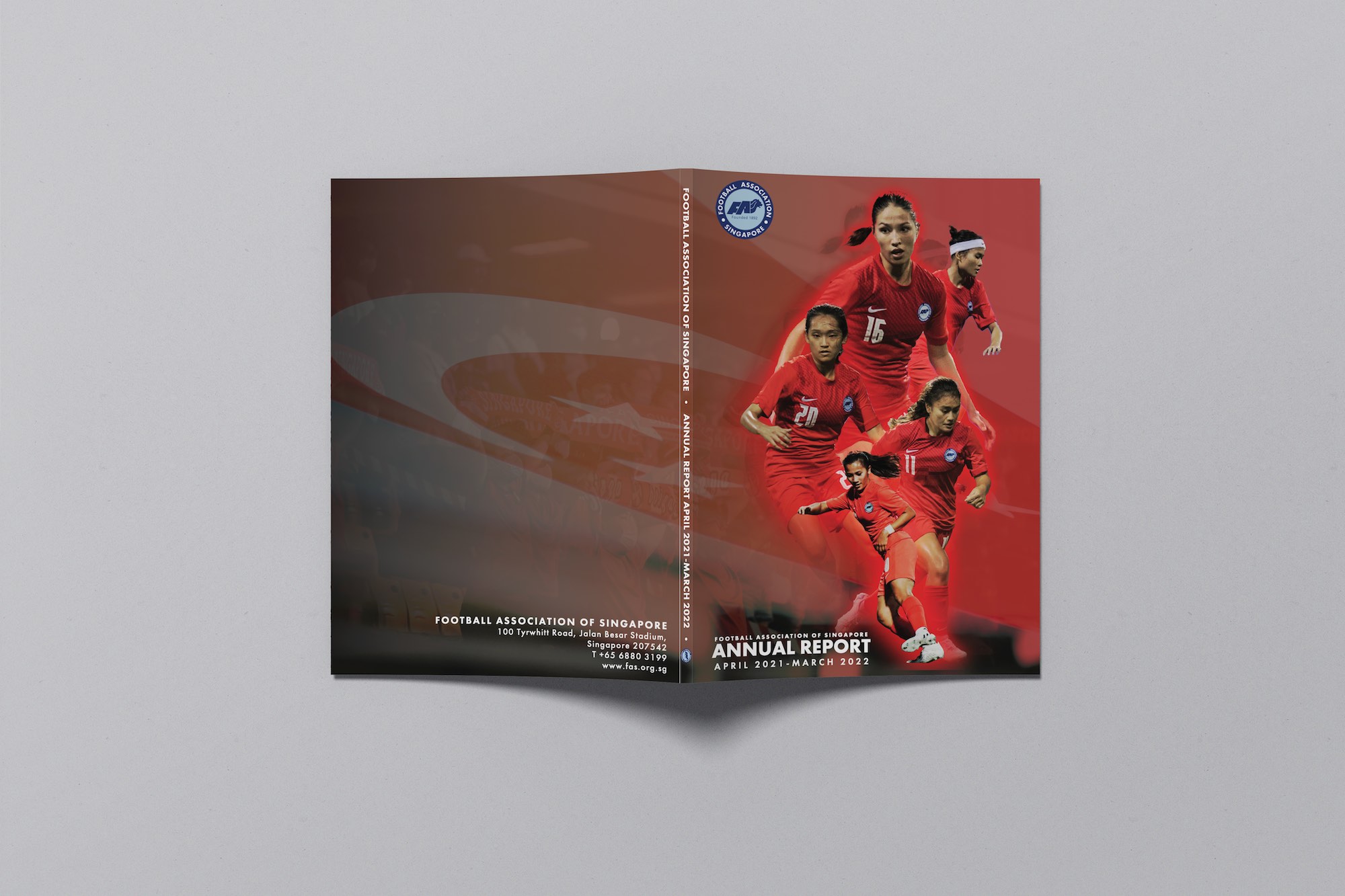
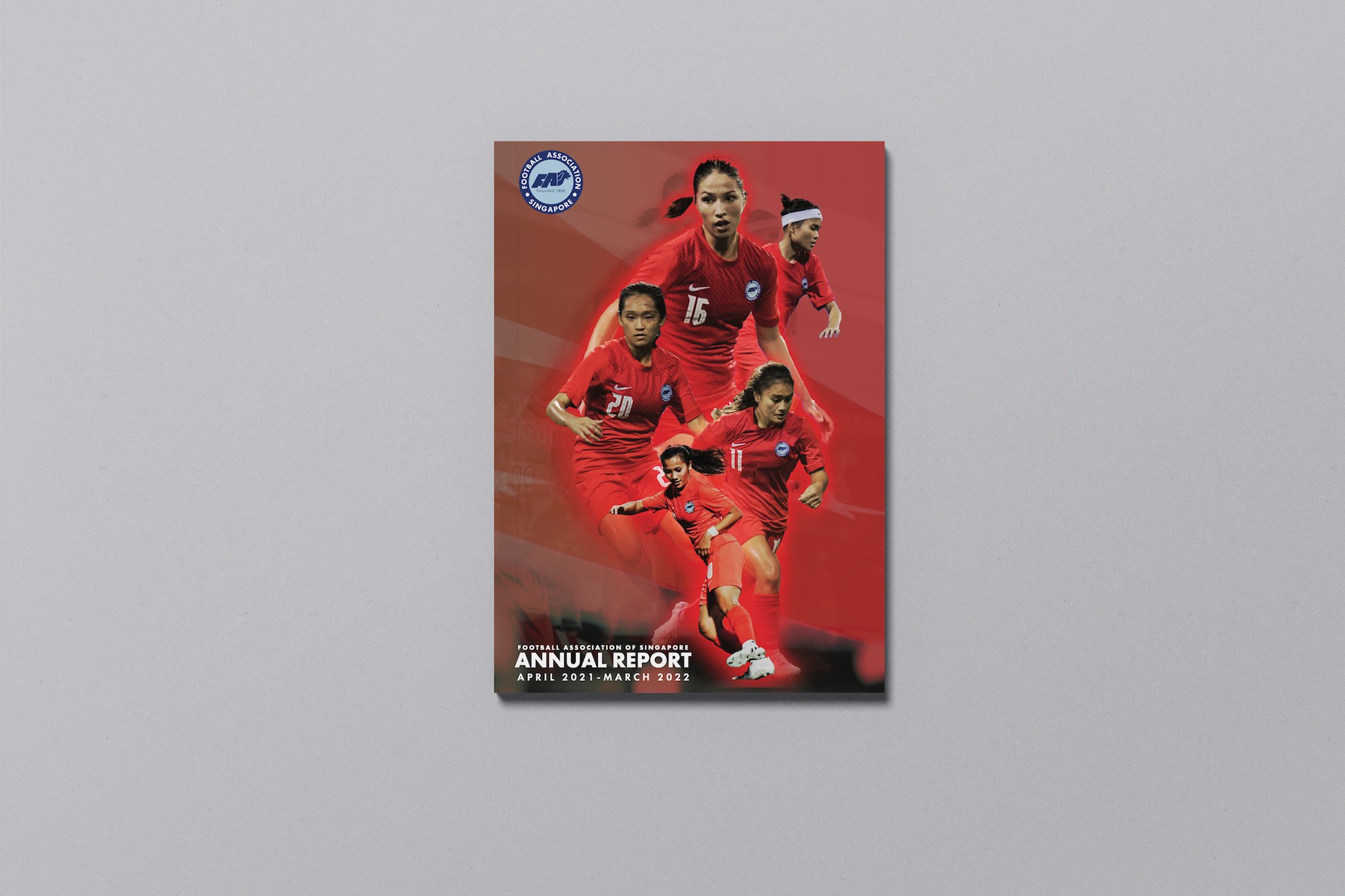
Making the cover page of the annual report look visually attractive was also one of our main objectives. After all, that is the first impression that people will have of FAS when they see the report, so it was essential to have an aesthetic cover page that represented the association well.
We used a striking red colour and overlaid a faded picture of patriotic Singaporean supporters with our local athletes, who are also dressed in our home colours. The fiery red is bright and striking, emitting a sense of passion, patriotism, and vitality, which is fitting for Team Singapore.
The design of the annual report is, of course, dependent on the organisation behind it. For instance, a pharmaceutical organisation might prefer to go with a more sterile blue and white colour palette for their annual report. On the other hand, a bakery franchise might choose warm brown and cream tones for their annual report.
At COCO Creative Studio, we make sure to customise our services to each client’s precise needs.


Looking Back
It was certainly refreshing to get a job that differed from our usual gigs. We didn’t have to worry about editing pictures or copy as they were all provided by the client. Instead, focusing on curating the best reading and viewing experience for the annual report was a fresh new objective for us.
This project was a long but fruitful one, and our staff are proud of the work that we have done in designing FAS’ Annual Report.
Indeed, we are a photography and videography studio, but our graphic design skills are second to none. Our list of services is available here—there’s something for everyone!
Do also check out our webpage on Tibet, a photography book by Jose Jeuland, designed right here at COCO Creative Studio.
Links and Social Media:
Instagram – @coco.creative.studio & @josejeuland
Facebook – COCO Creative Studio
Blog – https://cococreativestudio.com/blog-photography-videography
Website – https://cococreativestudio.com/ & https://www.josejeuland.com
COCO Creative Space – Photography & Video Studio Rental Space:
Instagram: @coco.creative.space
Website: https://cococreativespace.com/
Space: https://cococreativespace.com/book-studio-rental-singapore/
Facebook: COCO Creative Space